Pokémon Unite — academic case
A faster way into battle
An academic UX pass on Pokémon Unite — group the Switch menu so trainers reach Unite Battle faster, and put the score next to the map.
Project brief
Academic case, 2022 — a challenge to help trainers get into battle easier and faster through the UI. Pokémon Unite is a free-to-play MOBA from TiMi Studio Group, published by The Pokémon Company on Android and iOS and by Nintendo on Switch. Design Thinking, then a simpler main menu and a score on the battle screen.
Problem to address
The live main menu is so colorful, and so full of different buttons, that trainers cannot tell what is tappable or how to reach a section. Pokémon pick is slow. In battle they guess who is winning — and make bad calls because of it.
Goals
- Make the path to Unite Battle easier and faster
- Cut main-menu saturation so a section is one vertical move away
- Put the score on screen so players stop guessing who is winning
Design process
Design Thinking — used to find why trainers cannot get into a Unite Battle fast, and which UI change is worth the next sprint.
Problem
Empathize
- Desktop research
- FocusFive-game interviews
- Problem analysis
Define
- Affinity diagram
- Impact graph
Solution
Ideate
- Wireframes
- Benchmark
Prototype & Test
- Low-fi
- FocusUser testing
- High-fi
Methods
Research insights
Where five trainers got stuck
Five players walked the live UI. The impact graph put the main menu in Must: 3 of 5 said too many buttons, and 3 of 5 said the colors made a button hard to see. On battle, 4 of 5 said Pokémon pick takes too long, 4 of 5 could not tell a button from an image, and 4 of 5 wanted touch because the Joy-Con could not reach every control. Score sat in Won't — then the same five still asked for one.
4/5
Chose score above the map
vs
1/5
Chose the top-bar score
- Score above the map80%
- Top-bar score20%
When those five compared two score layouts, four chose proposal two: map and score in one place, above the map.
Competitive benchmark
To add a score, the deck used Dota 2 and League of Legends as the reference — then tested two placements with five players.
| Product | Score always on screen | Team / heroes in the chrome |
|---|---|---|
| Pokémon Unite (live) | — | — |
| Dota 2 | Strong | Strong |
| League of Legends | Strong | — |
| Proposal 2 | Strong | — |
Design decisions
Five groups instead of a saturated home
3 of 5 trainers said there were too many ways off the main screen. Trainer, Friends, Rewards, Shop, and Unite Battle sit in one vertical list so a section is a category, not a hunt.
One vertical Joy-Con move — and ZL for the shop
Every menu is on that same vertical gesture so the interaction stays consistent. Currency Shop also sits top-left with a ZL shortcut, because the business still needs the money source easy to spot and quick to open.
Same color and shape for anything tappable
4 of 5 said buttons were easy to mistake for an image. Matching color and shape on interactive items makes the menu readable before it is clever.
Put the score above the map
Players were guessing who was winning. Dota 2 and League keep a score in the chrome; five players then picked proposal two — map and score grouped — 4 to 1.
Product screens
Nintendo Switch
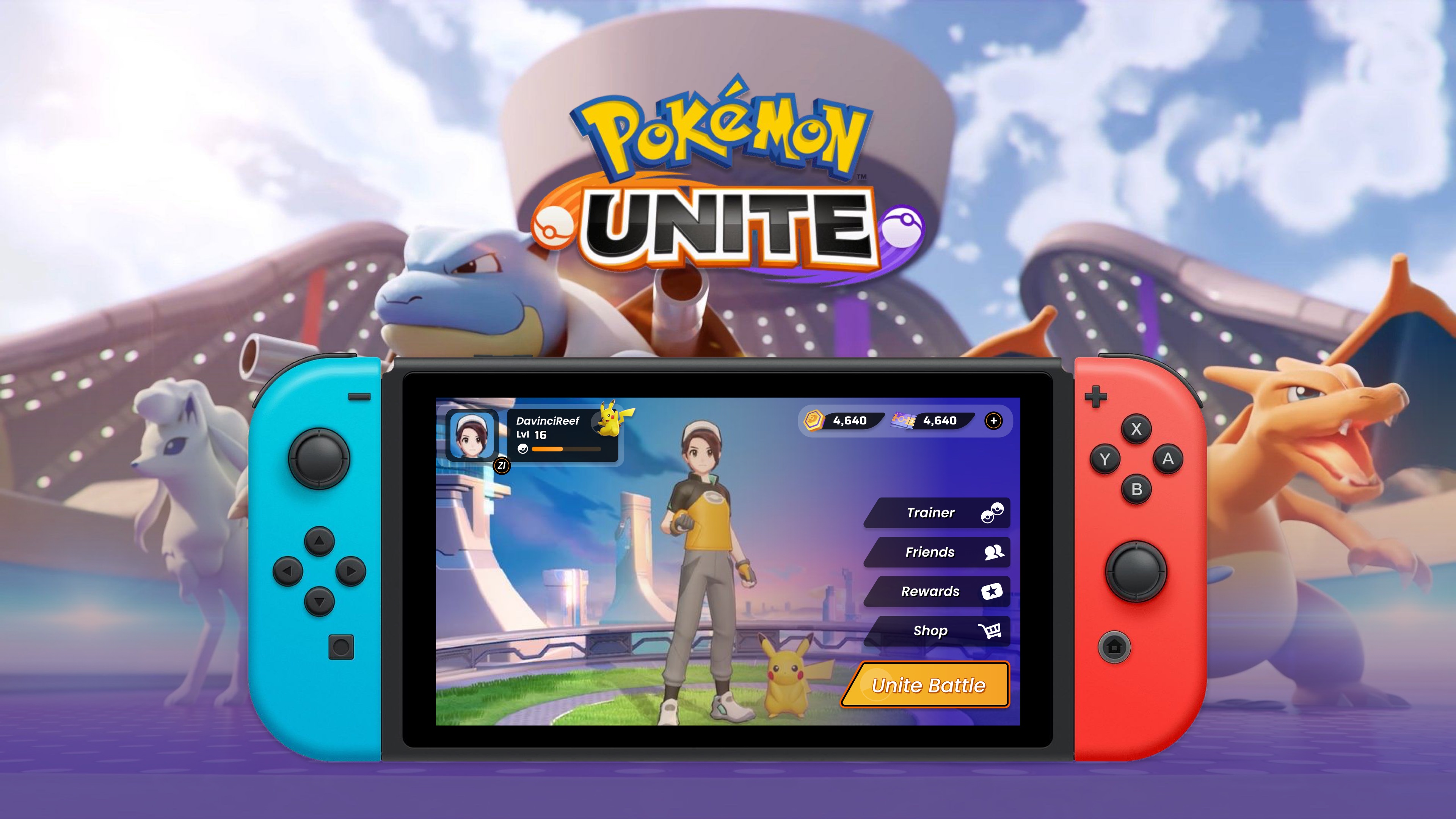
Grouped menu on Switch
Cover — Trainer, Friends, Rewards, Shop, and Unite Battle on one vertical list, with the shop still a tap away in the corner.
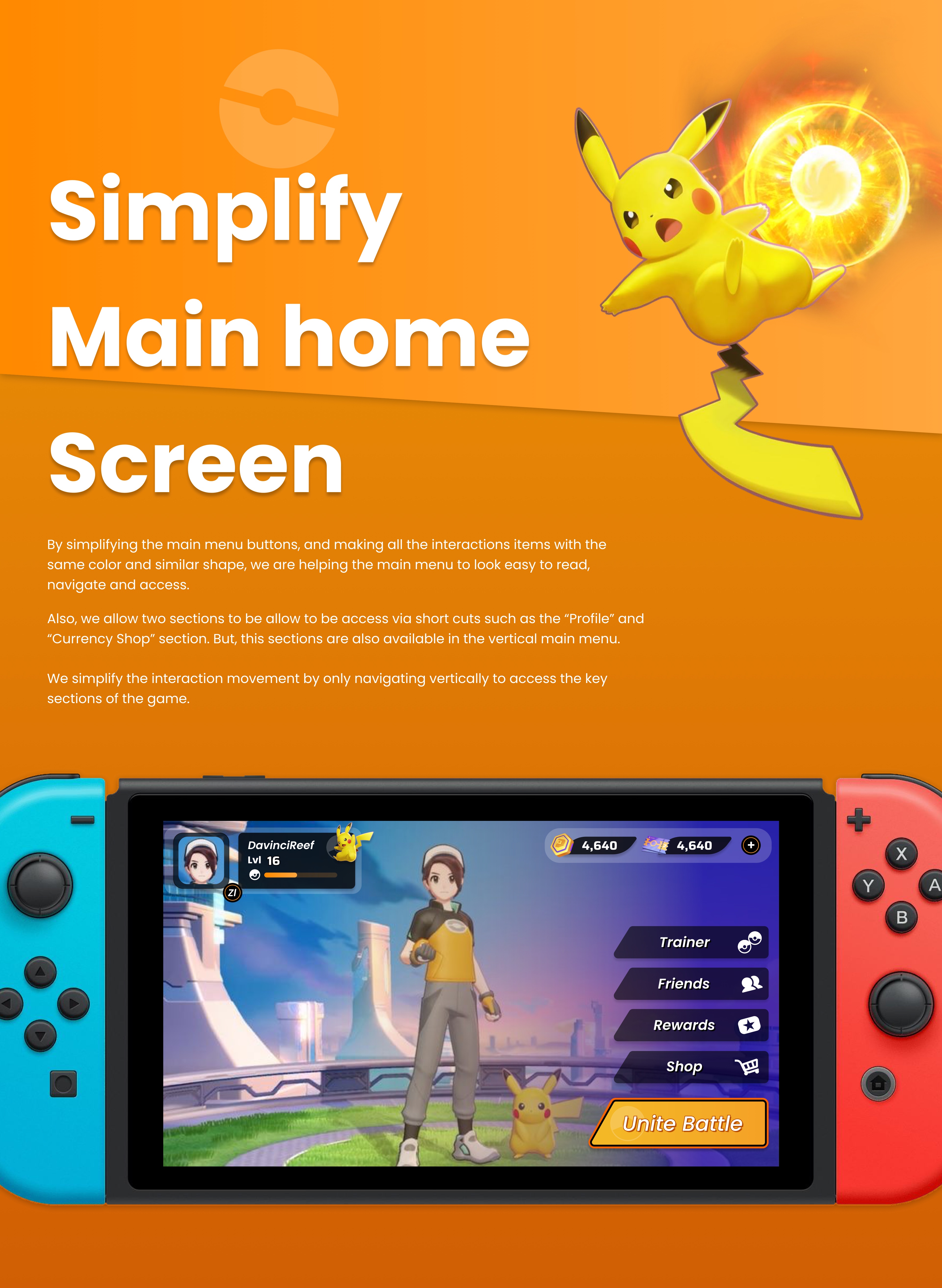
Main menu — fewer steps into battle
Same color and shape on every tappable item, one vertical list, and shortcuts for Profile and Currency Shop — so Unite Battle is fewer moves away.
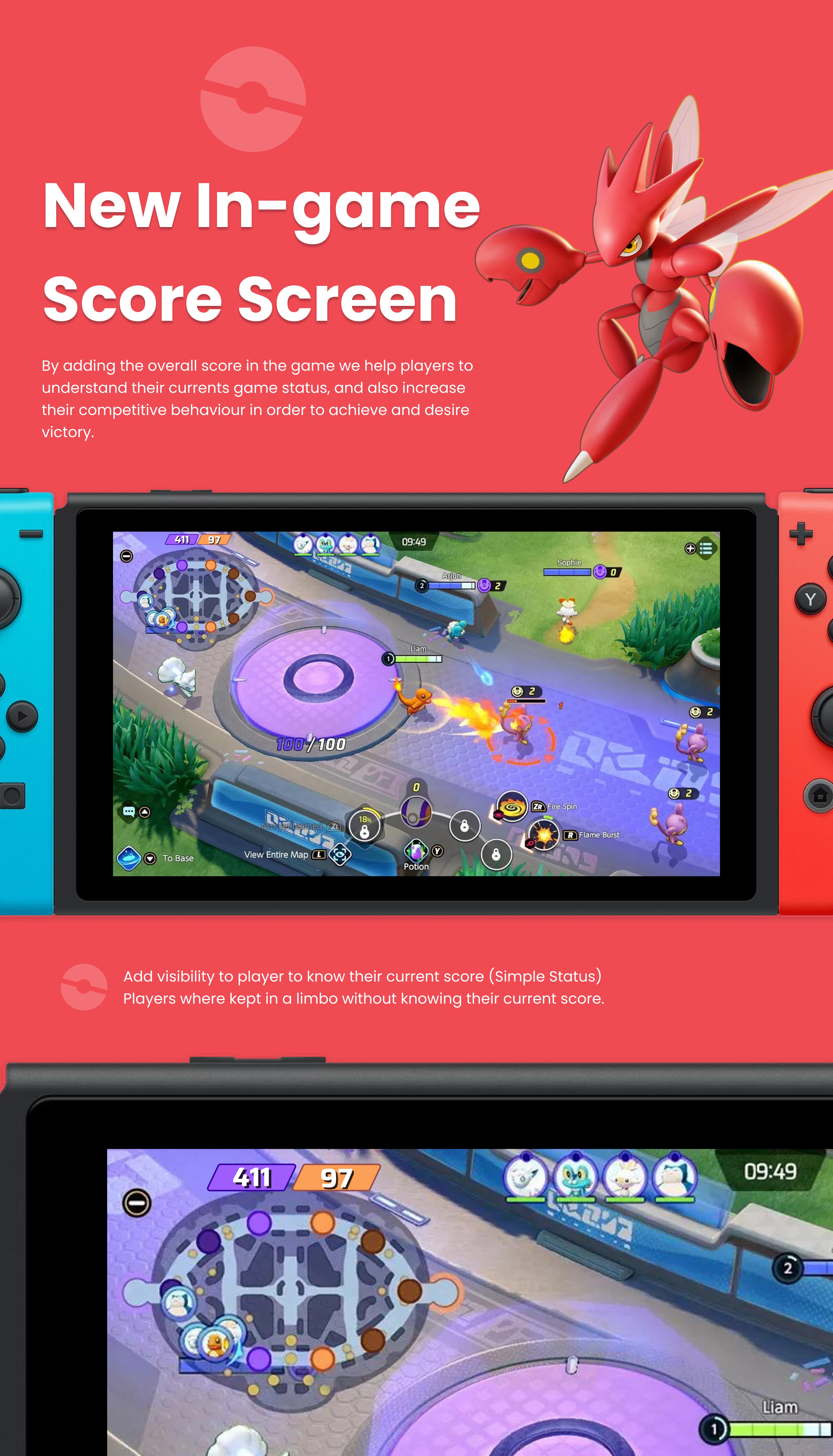
Score during the match
The current score sits above the map so players are not guessing who is winning — a simple status instead of a limbo.
Impact
Score discoverability
Increased
Players can see their current score during the match.
Steps to start playing
up to −30%
Fewer steps from the main menu into battle.
STAR case
Get trainers into battle faster
Situation
An academic challenge: several issues in the live Pokémon Unite UI, and a brief to make the way to battle easier and faster. The rest was open.
Task
Find what actually blocks five trainers, then ship the smallest UI that gets them into a match and tells them who is winning.
Action
Ran Design Thinking — desktop research, interviews, an affinity diagram, and an impact graph. Grouped the Switch menu, kept a ZL shop shortcut, bench-marked Dota 2 and League for score, and tested two score layouts.
Result
Score discoverability went up, and steps to start playing dropped by up to 30%. Four of five players had chosen grouping the score with the map.